- Table View
- List View
Typography: A Very Short Introduction (Very Short Introductions)
by Paul LunaTypography, the art of designing printed words, was once the domain of an elite few artists but has become an area with which millions of people engage daily. The widespread usage of digital devices from laptops to tablets and smart phones which are used for written communications means that we are regularly asked to make decisions about the fonts, sizes, and layouts we use in our writing. This broadening engagement with the field of typography has led to a perceptible shift from debates about legibility and technicalities to conversations about which fonts best reflect the writer's personality or style . In this Very Short Introduction, Paul Luna offers a broad definition of typography as design for reading, whether in print or on screens, where a set of visual choices are taken to make a written message more accessible, more easily transmitted, more significant, or more attractive. Considering the development of letterforms and the shapes of letter we use, Luna discusses the history behind our modern day letters and fonts, before considering the issues behind key typographic decisions, and the differences between printed and on-screen typography. Presenting any piece of typography as a fundamental design choice, Luna introduces the options available today, and explores the reasons why key typographic decisions are made. ABOUT THE SERIES: The Very Short Introductions series from Oxford University Press contains hundreds of titles in almost every subject area. These pocket-sized books are the perfect way to get ahead in a new subject quickly. Our expert authors combine facts, analysis, perspective, new ideas, and enthusiasm to make interesting and challenging topics highly readable.
Typography Pocket Essentials: The History and Principles of the Art
by Alistair Dabbs Alastair CampbellTypography is the most ubiquitous of the graphic arts, with all of us now having access to innumerable fonts and the typographic tools that can, in the right hands, lift any text from the mundane to the beautiful.Opening with an overview of the history of the art, Typography Pocket Essentials introduces the key principles and techniques of typography, and presents 200 of the most useful and important fonts, making it a handy primer and essential reference guide all rolled into one.- Learn the rich history of the art, from Gutenberg to Neville Brody and beyond- Master the principles of effective typography and create beautiful documents yourself- 200 key fonts are profiled for easy reference and rapid selection
The Typography Idea Book: Inspiration from 50 Masters
by Gail Anderson Gaile Anderson Steven HellerThe latest in this successful series, this book features around 150 of the most important buildings in the history of world architecture – from the pyramids and Parthenon to some of the most significant works by recent architects. The buildings are organized by type – from places of worship and public buildings to houses – and are divided into nine chapters, each with an informative introduction that surveys the history of that type. For each building there are numerous, accurate scale drawings showing a combination of floor plans, elevations and sections as appropriate, all specially redrawn for this book. The quality and number of the line drawings, together with the authoritative text by a renowned architectural historian, allow all the buildings to be understood in detail and make this an invaluable resource for students.
Typography Essentials (PDF)
by Ina SaltzTypography Essentials is a practical, hands-on resource to distill, organize, and compartmentalize—but not to oversimplify—the many complex issues surrounding the effective use of typography. It is for designers of every medium in which type plays a major role. A deep understanding of letterforms and knowledge of the effective use of letterforms can only be obtained with constant observation and experimentation; it evolves over a lifetime of design practice and study. This book is intended to advance the progress of designers seeking to deepen their typographic expertise; it is organized and designed to make the process enjoyable and entertaining, as well as instructional.This book is divided into four easy-to-use sections: The Letter, The Word, The Paragraph, and The Page. Each of the 100 principles has an explanation and examples representing the principle in action.
Typography and Motion Graphics: The 'Reading-Image'
by Michael BetancourtIn his latest book, Michael Betancourt explores the nature and role of typography in motion graphics as a way to consider its distinction from static design, using the concept of the ‘reading-image’ to model the ways that motion typography dramatizes the process of reading and audience recognition of language on-screen. Using both classic and contemporary title sequences—including The Man With the Golden Arm (1955), Alien (1979), Flubber (1998), Six Feet Under (2001), The Number 23 (2007) and Scott Pilgrim vs. The World (2010)—Betancourt develops an argument about what distinguishes motion graphics from graphic design. Moving beyond title sequences, Betancourt also analyzes moving or kinetic typography in logo designs, commercials, film trailers, and information graphics, offering a striking theoretical model for understanding typography in media.
Typography and Motion Graphics: The 'reading-image' (Routledge Studies In Media Theory And Practice Ser.)
by Michael BetancourtIn his latest book, Michael Betancourt explores the nature and role of typography in motion graphics as a way to consider its distinction from static design, using the concept of the ‘reading-image’ to model the ways that motion typography dramatizes the process of reading and audience recognition of language on-screen. Using both classic and contemporary title sequences—including The Man With the Golden Arm (1955), Alien (1979), Flubber (1998), Six Feet Under (2001), The Number 23 (2007) and Scott Pilgrim vs. The World (2010)—Betancourt develops an argument about what distinguishes motion graphics from graphic design. Moving beyond title sequences, Betancourt also analyzes moving or kinetic typography in logo designs, commercials, film trailers, and information graphics, offering a striking theoretical model for understanding typography in media.
A Typographic Workbook: A Primer to History, Techniques, and Artistry
by Kate Clair Cynthia Busic-SnyderLavishly illustrated with more than 450 images, A Typographic Workbook, Second Edition explains the process successful designers use to select, space, and creatively integrate fonts. This essential text demonstrates the use of type as a dynamic and expressive communication tool. This edition provides new and updated coverage of a broad range of topics–from a logical, clear historical overview of the craft to the latest digital technologies. Known for its highly interactive format, this Second Edition continues to include helpful review questions and multiple-choice quizzes, as well as many new projects and skill-building exercises that help readers immediately apply what they have learned. A Typographic Workbook, Second Edition is a valuable professional resource for working designers and an indispensable training tool for graphic design students.
Typographic Design: Form and Communication
by Rob Carter Sandra Maxa Mark Sanders Philip B. Meggs Ben DayThe bestselling introduction to designing the written word Typographic Design: Form & Communication is the definitive reference for graphic designers, providing a comprehensive introduction to the visual word. Done well, typopgraphy can communicate so much more than the words themselves. Typographic design determines how you feel about a message, the associations you make, and ultimately, the overall success of the communication. Typographic design extends from the page to the screen, and is a critical element of almost any graphic design project. This book provides essential guidance on everything related to type: from letterforms and negative space, to messaging, processes, and history, aspiring designers will find great utility in mastering these critical concepts. This new seventh edition has been fully updated with new coverage of contemporary typography processes, updated case studies, and new examples from branding, print, web, motion, and more. On-screen typographic design concepts are discussed in greater detail, and the online supplemental materials include new flashcards, terminology and quizzes. Understand design factors as they relate to type Explore communication and typographic messaging Learn how typography has evolved, and where it is headed Adopt established approaches to designing with type The irony of typographic design is that, when done well, it often goes unnoticed—but its impact on a project’s overall success is undeniable. Typography can make or break a page, can enhance or overpower an image, and can obscure a message or bring it into sharp focus. It is one of the most powerful tools in the graphic designer’s arsenal, and Typographic Design is the complete, practical introduction.
Typografische Animation für Studium und Praxis (X.media.press)
by Falk Hegewald Katharina Hien Steffen Rümpler Johannes TritschlerTypografische Animationen werden sehr häufig in Banner-Werbung im Internet genutzt, auf Webseiten, für Werbefilme sowie für Filmtrailer,-abspänne und -ankündigungen in Kino und TV. Das anvisierte Buch bietet neben den Grundlagen von typografischen Animationen eine ausführliche Sammlung mit Screenshots und Anleitungen zu typischen, anspruchsvollen Beispielen. Es richtet sich an aktive Designerinnen und Designer und an Studierende im Design-Bereich, die sich in das Thema einarbeiten wollen. Die Anleitungen des Buches sollen es auch Quereinsteigern ermöglichen, sich effektiv in die Materie einzuarbeiten. Der grundlegende Umgang mit den "gängigen" Design-Programmen wird jedoch vorausgesetzt. Die Gliederung richtet sich nach häufig genutzten Animations-Programmen. Jedes der genutzten Softwareprodukte gibt eine bestimmte ästhetische und funktionale Ausrichtung vor (2-D, 3-D, interaktiv).
Typografie: Schrifttechnologie - Typografische Gestaltung - Lesbarkeit (Bibliothek der Mediengestaltung)
by Peter Bühler Patrick Schlaich Dominik SinnerDieser Band der „Bibliothek der Mediengestaltung“ behandelt die Schrifterkennung und Schriftklassifikation, die Lesbarkeit von Schrift und den gestalterischen und technischen Einsatz von Schriften. Außerdem werden die Schrifttechnologie und die Verwaltung von Schriften thematisiert. Für diese Bibliothek wurden die Themen des Kompendiums der Mediengestaltung neu strukturiert, vollständig überarbeitet und in ein handliches Format gebracht. Leitlinien waren hierbei die Anpassung an die Entwicklungen in der Werbe- und Medienbranche sowie die Berücksichtigung der aktuellen Rahmenpläne und Studienordnungen sowie Prüfungsanforderungen der Ausbildungs- und Studiengänge.Die Bände der „Bibliothek der Mediengestaltung“ enthalten zahlreiche praxisorientierte Aufgaben mit Musterlösungen und eignen sich als Lehr- und Arbeitsbücher an Schulen sowie Hochschulen und zum Selbststudium.
Typical Men: The Representation of Masculinity in Popular British Cinema (Cinema and Society)
by Andrew SpicerTypical Men is the first book length study of masculinity in British cinemaand offers a broad and lively overview from the Second World War to the present day. Spicer argues that masculinity in popular fiction can best beunderstood as a range of dynamic and competing cultural types which rise and fall in relation to shifting patterns of film production, audience taste and social change. Specific chapters are devoted to each of the major types debonair gentlemen, civilian professionals, action adventurers, the Ever yma n, Fools and Rogues, criminals, rebels and damaged men - which trace their changing histories through innovative readings of key films, together with a fresh look at the performances of particular stars including James Mason, Kenneth More, Michael Caine and Sean Connery. A final chapter explores the complex and hybrid types that have evolved within a volatile and unstable contemporary British cinema, now part of an array of interrelated media images of masculinity.Typical Men will be of keen interest to those concerned with the culturalhistory of gender, and its detailed and carefully contextualised interpretations of films afford a reappraisal of British cinema history, especially the neglected and despised 1950s.'Andrew Spicer's Typical Men is a major intervention in debates about masculinity in the cinema. It takes a lot of intellectual risks, and locates cinematic stereotypes of masculinity in a cinematic and cultural context. It is trenchant and original, and redefines the field of gender representation.' – Sue Harper, Professor of Film History, University of Portsmouth'The strength of this elegantly and wittily written book is that, in the precision of its detail about individual performances, actors and films, it never loses sight of its argumentative threads.' – Brian McFarlane, Screening the Past
Typical Girls (Modern Plays)
by Morgan Lloyd MalcolmIn a mental health unit inside a prison, a group of women discover the music of punk rock band The Slits and form their own group. An outlet for their frustration, they find remedy in revolution. But in a system that suffocates, can rebellion ever be allowed?Written by Morgan Lloyd Malcolm (Emilia), Typical Girls is a funny, fierce and furious part-gig, part-play, co-commissioned by Clean Break theatre company.
Type Specimens: A Visual History of Typesetting and Printing
by Dori GriffinType Specimens introduces readers to the history of typography and printing through a chronological visual tour of the books, posters, and ephemera designed to sell fonts to printers, publishers, and eventually graphic designers. This richly illustrated book guides design educators, advanced design students, design practitioners, and type aficionados through four centuries of visual and trade history, equipping them to contextualize the aesthetics and production of type in a way that is practical, engaging, and relevant to their practice. Fully illustrated throughout with 200 color images of type specimens and related ephemera, the book illuminates the broader history of typography and printing, showing how letterforms and their technologies have evolved over time, inspiring and guiding designers of today.
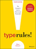
Type Rules, Enhanced Edition: The Designer's Guide to Professional Typography
by Ilene StrizverType Rules!, Fourth Edition is an up-to-date, thorough introduction to the principles and practices of typography. From the fundamentals to cutting-edge applications, this edition has everything today's serious designer needs to use type effectively. Dozens of exercises reinforce authoritative coverage on such topics as how to select the appropriate type for the job, how to set type like a pro, and how to design a typeface, as well as how to fully harness the power of major design packages including the Adobe Creative Suite.Includes video clips showing examples of projects discussed in Chapter 11- Type on the Web and Chapter 12- Type in Motion
Type Rules: The Designer's Guide to Professional Typography
by Ilene StrizverType Rules!, Fourth Edition is an up-to-date, thorough introduction to the principles and practices of typography. From the fundamentals to cutting-edge applications, this edition has everything today's serious designer needs to use type effectively. Dozens of exercises reinforce authoritative coverage on such topics as how to select the appropriate type for the job, how to set type like a pro, and how to design a typeface, as well as how to fully harness the power of major design packages including the Adobe Creative Suite.Includes video clips showing examples of projects discussed in Chapter 11- Type on the Web and Chapter 12- Type in Motion
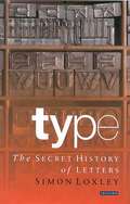
Type: The Secret History of Letters
by Simon LoxleyType is the bridge between writer and reader, between thought and understanding. Type is the message bearer: an art-form that impinges upon every literate being and yet for most of its history it has conformed to the old adage that 'good typography should be invisible', it should not distract with its own personality. It was only at the end of the nineteenth century that designers slowly realised that they could say as much with their lettering as writers could with their words. Form, of course, carries as much meaning as content. Now, anyone within reach of a computer and its limitless database of fonts has the same power. "Type: The Secret History of Letters" tells its story for the first time, treating typography as a hidden measure of our history. From the tempestuous debate about its beginnings in the fifteenth century, to the invention of our most contemporary lettering, Simon Loxley, with the skill of a novelist, tells of the people and events behind our letters. How did Johann Gutenberg, in late 1438, come to think of printing? Does Baskerville have anything to do with Sherlock Holmes? Why did the Nazis re-invent Blackletter? What is a Zapf?"Type" is a guide through the history of our letters and a study of their power. From fashion through propaganda and the development of mass literacy, Loxley shows how typography has changed our world.
Type: The Secret History of Letters
by Simon LoxleyType is the bridge between writer and reader, between thought and understanding. Type is the message bearer: an art-form that impinges upon every literate being and yet for most of its history it has conformed to the old adage that 'good typography should be invisible', it should not distract with its own personality. It was only at the end of the nineteenth century that designers slowly realised that they could say as much with their lettering as writers could with their words. Form, of course, carries as much meaning as content. Now, anyone within reach of a computer and its limitless database of fonts has the same power. Type: The Secret History of Letters tells its story for the first time, treating typography as a hidden measure of our history. From the tempestuous debate about its beginnings in the fifteenth century, to the invention of our most contemporary lettering, Simon Loxley, with the skill of a novelist, tells of the people and events behind our letters. How did Johann Gutenberg, in late 1438, come to think of printing? Does Baskerville have anything to do with Sherlock Holmes? Why did the Nazis re-invent Blackletter? What is a Zapf? Type is a guide through the history of our letters and a study of their power. From fashion through propaganda and the development of mass literacy, Loxley shows how typography has changed our world. 'Simon Loxley's quirkily elegant Type follows hard on the heels of Lynne Truss's Eats, Shoots and Leaves. It is better designed and typeset than that unlikely bestseller, and its subject, type, is central to the experience of every reader… A heady mixture of intrigue, personal achievement and corporate greed' Justin Howes, Times Literary Supplement'Simon Loxley reads between the lines in Type… underscoring the passion and ambition of its designers and highlighting the role that business and technological breakthroughs have had in the way we print and read today' History Today
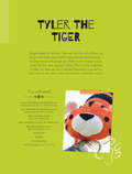
Tyler the Tiger Soft Toy Pattern
by Mariska Vos BolmanTyler the Tiger Soft Toy Pattern comes with full size pattern pieces and clear instructions and diagrams. This is a more advanced soft toy pattern but with expert guidance from the author anyone could easily complete this tiger soft toy project.
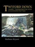
Twyford Down: Roads, campaigning and environmental law
by Barbara BryantThe Twyford Down story is set in a political and historical framework in order to examine the key issues affecting road planning and environmental protection: the system of route selection; Crown development; government agents, NGOs and locally elected authorities; conservation legislation; subsidiarity; lobbying techniques; and the role of the press. Written in a lively style and vividly illustrated, Twyford Down will appeal to environmental advisors, policy makers and planners as well as lobbyists and those interested in the environment.
The Two Worlds of Charlie F.
by Owen SheersWelcome to our war The Two Worlds of Charlie F. is a soldier's view of service, injury and recovery. Moving from the war in Afghanistan, through the dream world of morphine-induced hallucinations to the physio rooms of Headley Court, the play explores the consequences of injury, both physical and psychological, and its effects on others as the soldiers fight to win the new battle for survival at home. Drawn from the personal experience of the wounded, injured and sick Service personnel involved, Owen Sheers's The Two Worlds of Charlie F. premiered at the Theatre Royal Haymarket, London, in January 2012 and toured nationally that summer.
Two Weeks in the Midday Sun: A Cannes Notebook
by Roger EbertA paragon of cinema criticism for decades, Roger Ebert—with his humor, sagacity, and no-nonsense thumb—achieved a renown unlikely ever to be equaled. His tireless commentary has been greatly missed since his death, but, thankfully, in addition to his mountains of daily reviews, Ebert also left behind a legacy of lyrical long-form writing. And with Two Weeks in the Midday Sun, we get a glimpse not only into Ebert the man, but also behind the scenes of one of the most glamorous and peculiar of cinematic rituals: the Cannes Film Festival. More about people than movies, this book is an intimate, quirky, and witty account of the parade of personalities attending the 1987 festival—Ebert’s twelfth, and the fortieth anniversary of the event. A wonderful raconteur with an excellent sense of pacing, Ebert presents lighthearted ruminations on his daily routine and computer troubles alongside more serious reflection on directors such as Fellini and Coppola, screenwriters like Charles Bukowski, actors such as Isabella Rossellini and John Malkovich, the very American press agent and social maverick Billy “Silver Dollar” Baxter, and the stylishly plunging necklines of yore. He also comments on the trajectory of the festival itself and the “enormous happiness” of sitting, anonymous and quiet, in an ordinary French café. And, of course, he talks movies. Illustrated with Ebert’s charming sketches of the festival and featuring both a new foreword by Martin Scorsese and a new postscript by Ebert about an eventful 1997 dinner with Scorsese at Cannes, Two Weeks in the Midday Sun is a small treasure, a window onto the mind of this connoisseur of criticism and satire, a man always so funny, so un-phony, so completely, unabashedly himself.
